
Cook County Public Guardian site - A redesign from the ground up, CCPG's new Website is organized, fresh and leads users through their text and information heavy content with ease. Unique drop down menus, footer call-outs and great site hierarchy ensure this new site will continue to grow without loosing design or meaning. http://www.publicguardian.org/

Homescape Builders Web site - With a large collection of photos for their portfolio, Homescape Builders was looking for a concise and minimal site to showcase their work. A muted color palette, simple navigation and text area that can be hidden allow their work to speak for itself.
http://www.homescapeinc.com

Grandstand Sox Web site - With a well established web presence and a strong client-base, Grandstand was interested in a complete redesign of their website. With extensive updates to branding and organization, the end result is a interesting and unique design.
http://grandstandsox.com/

Design Travel Web site design (CMS) - Specializing in luxury travel and trips, Design Travel wanted a site that would appeal to affluent clients and engage users with beautiful imagery. Using gorgeous travel photos as a focal point the rest of the site is a simple and organized CMS. http://wedesigntravel.com/

Reef Design Group Web site design - The client wanted a site to set his business apart from his competition and engage potential new clients. The resulting solution was a colorful, detail-oriented site with custom graphics throughout and a bit of humor.
www.chicagoreefdesign.com

IMSIF website - The Illinois Mine Subsidence Fund was looking to update their website and improve usability. They wanted to be able to gently lead users through the website without using generic links and navigation. The end result is a warm, concise site that presents their wealth of content in an organized way.
view site:
https://www.imsif.com/

The Family Institute at Northwestern University - CMS website - TFI was looking to update the design and usability of their website. They needed to be able to update content themselves but have the styling of the text remain consistent. The end result is a flexible CMS site design that draws focus to key topics while offering organized navigation to very detailed and complex content.
view site:
http://www.family-institute.org/
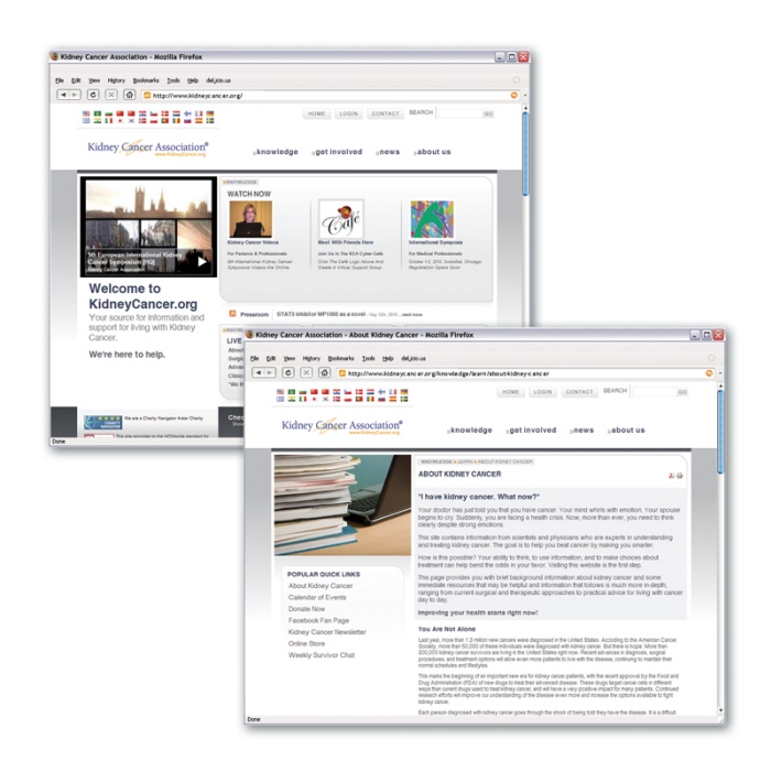
Kidney Cancer Association website - The client was looking for a more organized, structured site that would lead the user. They wanted users to be able to get anywhere in the site easily and quickly. The final result uses simple categories to organize the site's large amount of content.
View site:
http://www.kidneycancer.org/
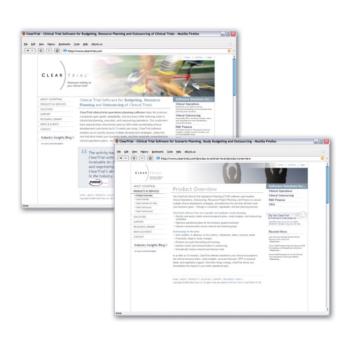
ClearTrial website - Simple and classic, the client wanted to strip the graphics and site down until the feeling was that of a Japanese Zen garden that would relax the viewer. CMS implementation and development done by Derik Rhodes at Chicago Producers.
(since been reskinned by another firm)
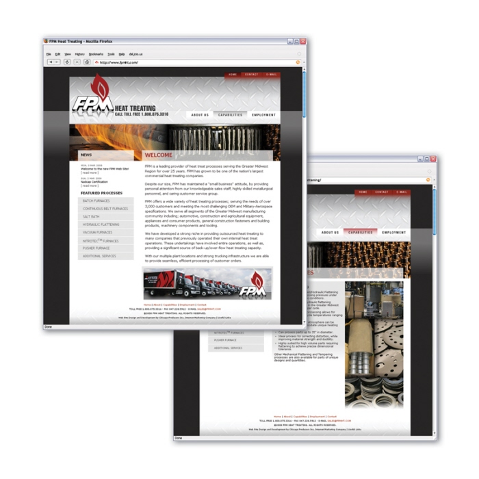
FPM Heat Treating - http://www.fpmht.com - FPM was interesting in a visually interesting site that would attract new clients without alienating old ones. They also wanted to move towards a modern mood.
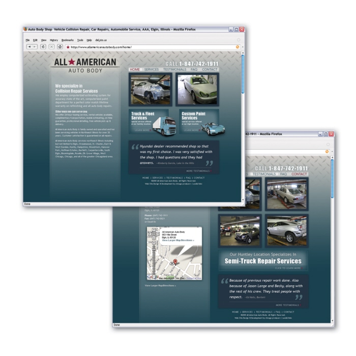
All American Auto Body website - The client was interested in a website that would attract new business but was fairly simple and easy to navigate. The elements would need to be able to grow with the content and the business.
view website:
http://www.allamericanautobody.comseveral images could be replaced with a larger flash movie or portfolio. The site branched off and expanded on the client's new brand.
view website:
http://www.allamericanautobody.com/
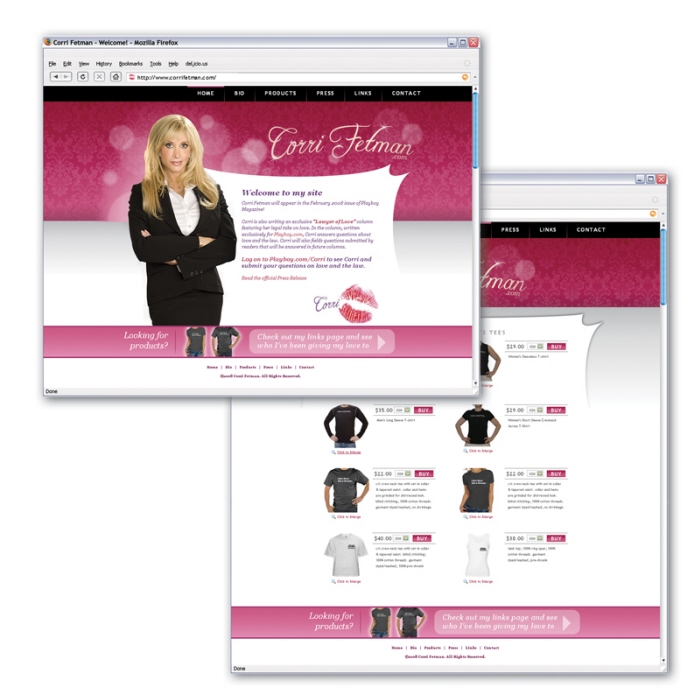
Corri Fetman - http://www.corrifetman.com - Simple personal site for a Chicago attorney. She wanted a feminine and sexy design to showcase her side projects. Turnaround on design and dev was 1 week.
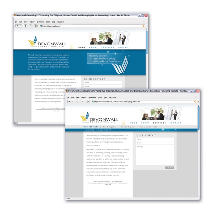
Devonwall Consulting - http://www.devonwall.com - The client was looking for a simple brochure site that would present Devonwall as a professional contented in the industry. Devonwall maintains many international clients and wanted the website to reflect a global theme. I designed the flash concept to illustrate that point. Steve Woodson produced the flash at Chicago Producers.
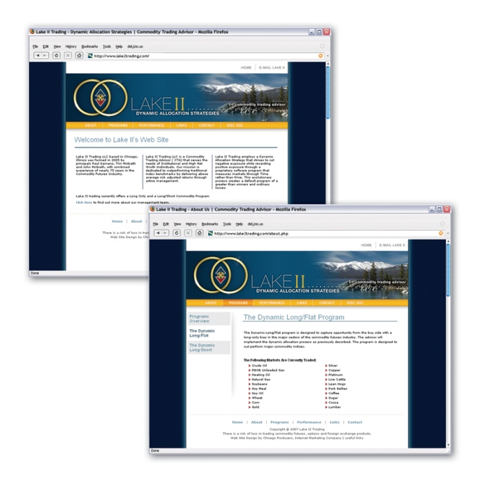
Lake II Trading - http://www.lake2trading.com - With a limited budget and time this client wanted a simple brochure site that would show case their logo. Flash work was done by Steve Woodson at Chicago Producers based on my limited direction. Client has made changes to original layout concept since launch.
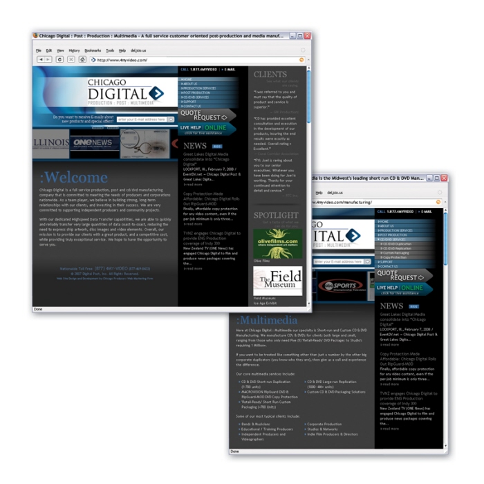
Chicago Digital - http://www.4myvideo.com - The client was looking for a slightly non traditional site. The initial design has been modified by the client since going live but the structure played off the web screen resolution principles. The home page spanned 990px while inner pages cropped to 770 to focus on the content.
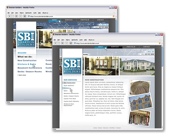
Shardon Builders Inc. - http://www.sharlen.com - Basic portfolio/brochure site for a family run successful construction company.
shardonbuilders.com
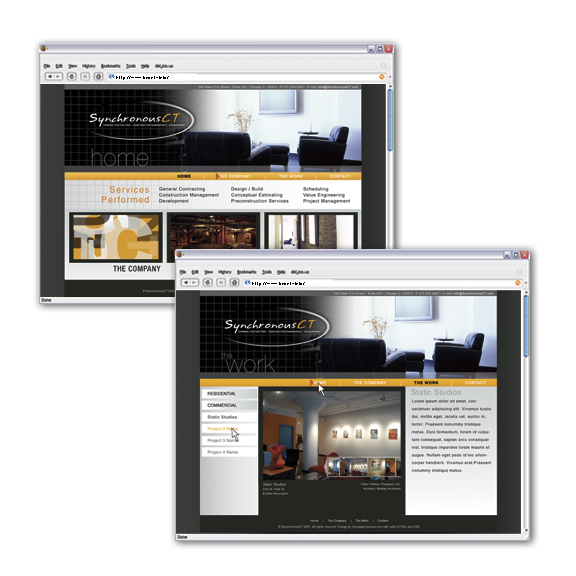
SynchronousCT - htt://www.sychronousct.com - Brochure site for a construction management company with heavy portfolio focus. I designed several ways to showcase their work in interactive and revolving ways.
http://synchronousct.com/
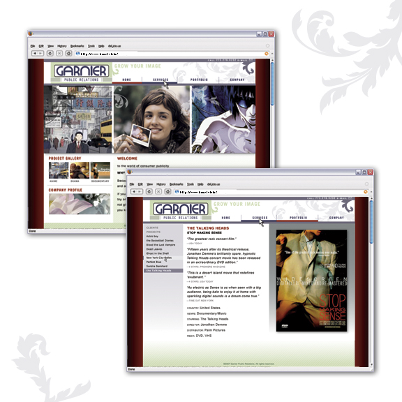
Garnier PR - http://www.garnierpr.com - Client was interested in an engaging portfolio site for their diverse projects. I designed a site that showcased the wealth of visually stimulating projects that they have worked on. I also wanted to appeal and relate to the large number of Japanese projects in their portfolio. The end result is a colorful image heavy portfolio site that appeals to the entertainment industry.
http://garnierpr.com/

Ishida Financial Research - http://www.ishidafinancial.com - Design for a data driven financial subscription site. Heavy Japanese influences. Logo design as well.
https://www.ishidafinancial.com/
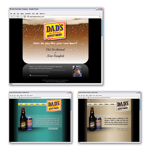
Dad's Root Beer - http://www.dadsrootbeer.com - Client wanted a site to engage and entertain their audience. We had a limited budget but wanted to do some fun flash and interactive elements.
I devised a concept where the user can select between the original "new fangled" site or a sepia-toned "old-fashioned" one. The end result was within budget and involves the audience in the site more than a standard brochure site would.
http://dadsrootbeer.com/
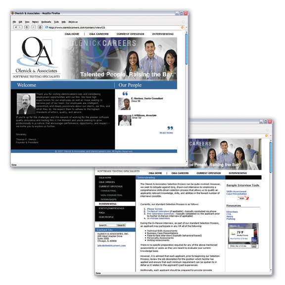
Olenick Careers - http://www.olenickcareers.com - Client wanted a very specific CMS (content management system) to house the career opportunities portion of their online offerings. I worked with existing logos and images to design a site which complements their other sites and is visually engaging.
http://olenickcareers.com/
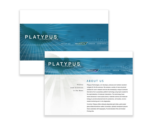
Platypus Technologies - http://www.platypustech.com - Client was interested in a simple brochure and sales site that would educate and entertain thei audiences. I designed teh site with some interesting flash pieces as well. (flash code and development by Tin Debyl - Distillery Design Studios, sub flash piece by Brad Nellis - Distillery Design Studios.) Launch Summer 2006
http://www.platypustech.com/
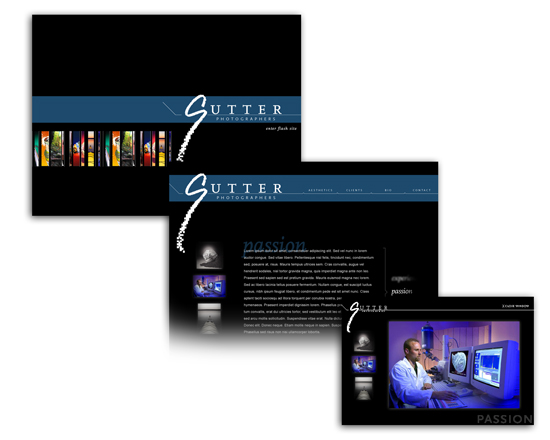
Sutter Photographics web site - Client needed a redesign of their website that would focus on their excellence in service. I also needed to incorporate some of their portfolio but wanted to place focus on clients and service records above all.
gLike
web