
Oh What! logo & branding - A probono project created for a music group located in San Francisco, CA. The client was looking for something text-based and a little gritty that could work in many color palettes.

The Exchange Bar logo - A throw back to simpler times. When men were men and making drinks was an art form. The Exchange is a new craft cocktail bar in a prominent Chicago neighborhood. They were looking for a bold logo with strength and elegance. The brand draws inspiration from 1850s printed material with sepia colors and gritty illustrations.
See additional branding in print category.

E&K Contractors - logo & collateral - With a bold color palette, strong stencil typography and a unique icon, the final E & K Contractors' logo and branding is bold and minimal and sets them apart in the industry.

E&K Contractors - logo & collateral - With a bold color palette, strong stencil typography and a unique icon, the final E & K Contractors' logo and branding is bold and minimal and sets them apart in the industry.

Pivotal Link - logo/business card - Client was interested in a dynamic, unique logo and business card on a very low budget. The simple layout, type based logo and service words cloud on the back fit a lot of information on a small card without sacrificing design.
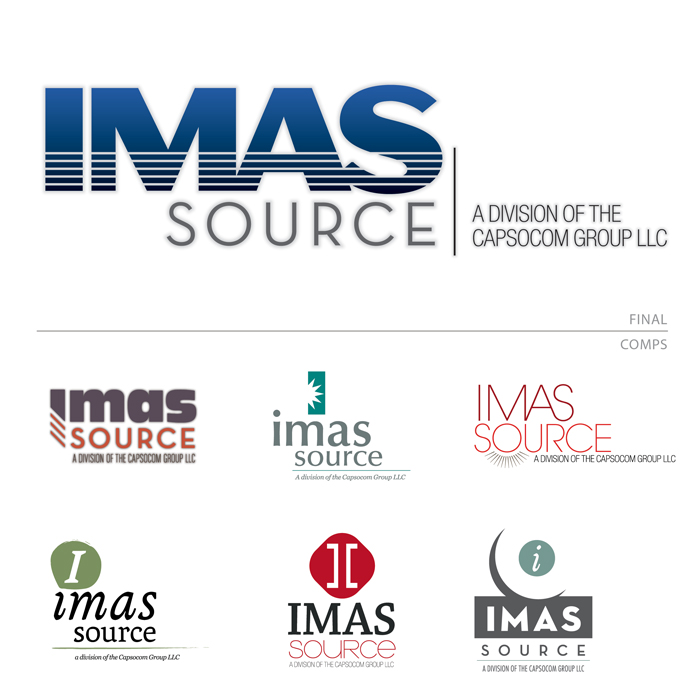
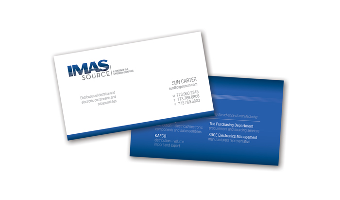
IMAS Source logo/branding - The client had a very limited budget but needed a lot of impact to get her company name out there.
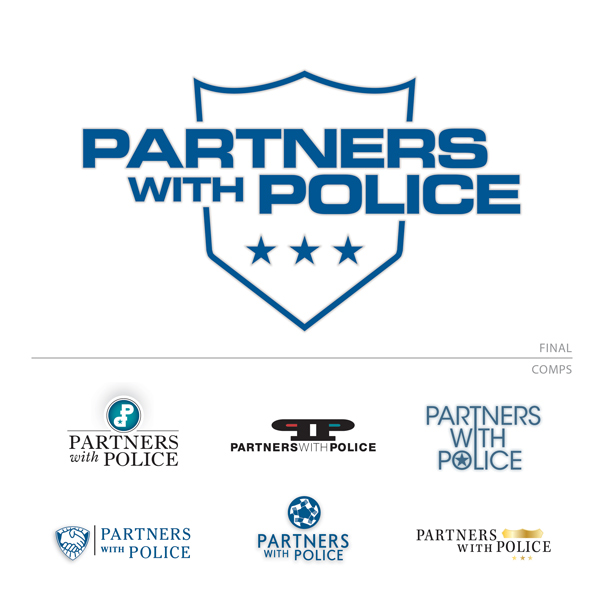
Partners With Police - logo / branding - The client was looking for an iconic logo that would emphasize their connection to the law enforcement industry but would also attract governmental support. The comps ranged in style to satisfy conflicting partner's tastes. In the end they were both extremely happy with the strong graphical solution.
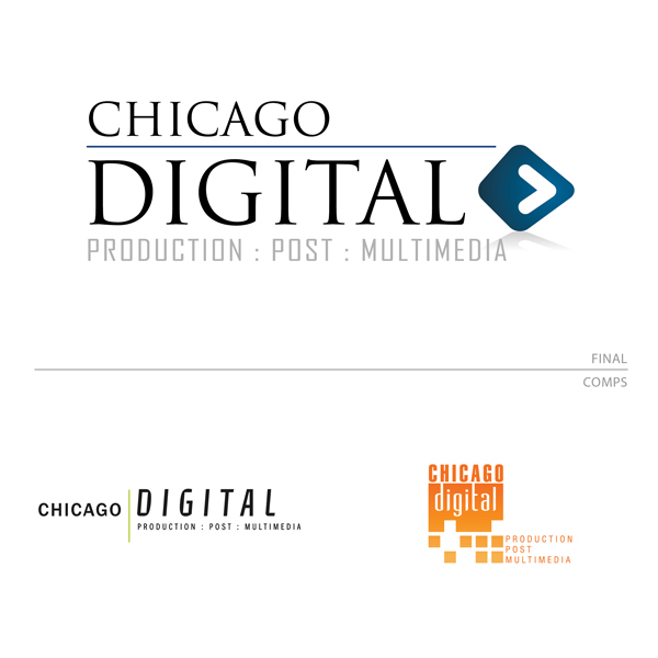
Chicago Digital - logo and branding - Chicago Digital was looking for a fresh take on their logo. They wanted something classic yet modern to lead the company to continued success. The new logo was debuted on the company's new website that I designed as well. (http://www.4myvideo.com/)
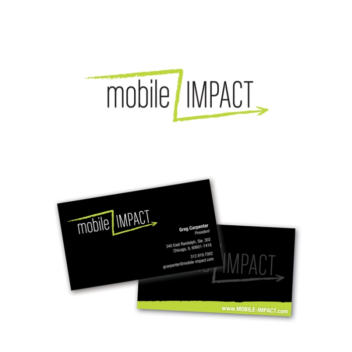
Mobile Impact - logo / collateral - Client was looking for a simple textual logo that would also express their business. Mobile Impact runs high end scrolling truck advertising in downtown Chicago. The mark relates to their zig-zag route through the city.
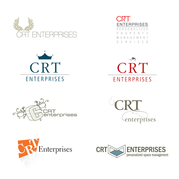
CRT Enterprises - logo comps / branding - These are comps were for a new high-end real estate management company. The client decided to abandon the venture before choosing for personal reasons.
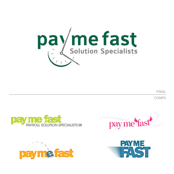
Pay Me Fast - logo / branding - This logo was developed as a phase 1 redesign for the client's existing website. The colors and graphics were meant to be approachable and modern while conveying a message about the company.
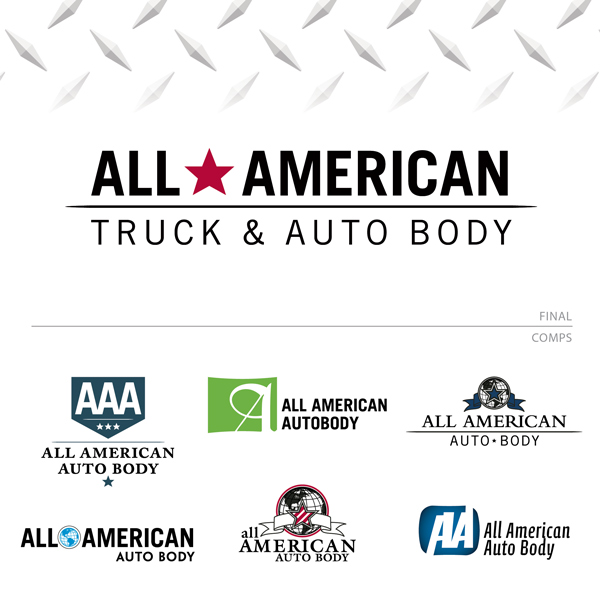
All American Auto Body - logo / branding - A classic and contemporary logo for an old school auto body shop. All American needed a new logo to start their sister business off with a bang. They needed a logo that was classic and mirrored the name but would be easy to customize for future businesses with slightly different names. The end result is a marriage of hard metal with patriotic overtones appealing to the average driver and the auto buff. I designed the company's website, launching soon.

Ishida Financial Research - logo / site branding - Logo concept employing two Japanese Kanji characters. The client was interested in entertaining a Japanese feeling as well as clean, modern lines. The logo was designed in tangent with the client's website which I designed as well. The bright orange color was chosen to contrast, as well as harmonize with the subtle ocean colors of the site and collateral pieces. ( www.ishidafinancial.com).
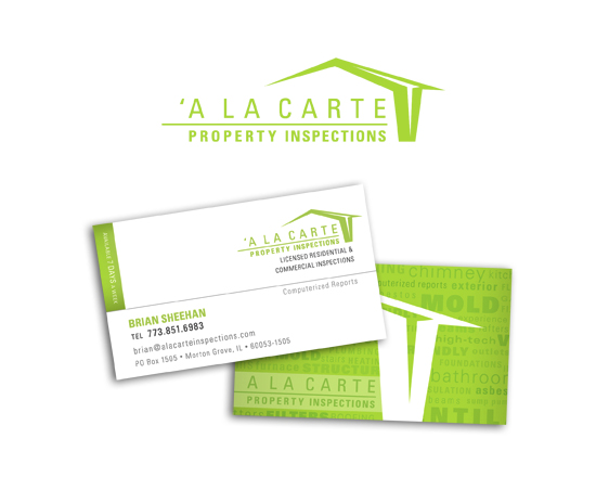
Ala Carte Inspections logo/collateral - Designed of logo and identity. Client was interested in appearing fresh and new as opposed to tacky which is the standard in the industry.
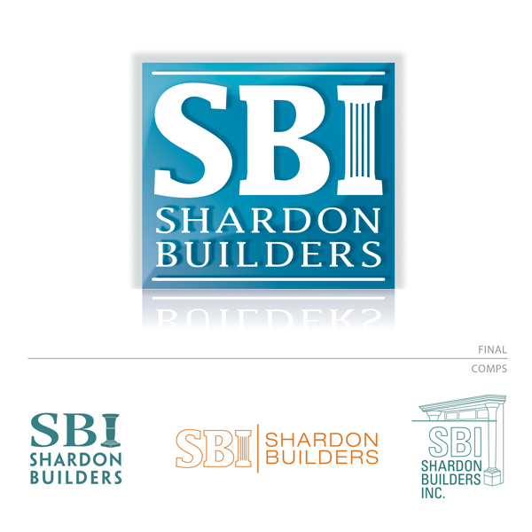
Shardon Builders - logo / web branding - A strong and simple logo for a very busy construction company. They wanted to keep it simple, and needed a logo that could be used in a simple black and white form as well as a dynamic and colorful web logo. It needed to represent a modern yet classic construction company and appeal to a wide audience. In the end we stuck with the basics and used a classic column fused with the "I" to define the business. I also designed the company's website. (http://www.shardonbuilders.com/)
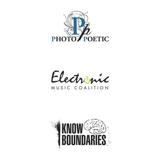
Logo comps - These were all from separate free-lance clients in 2006.
-Photo Poetic is a music/entertainment team that does electronic music with abstract visuals.
-Electronic Music Coalition was a UW student group that was involved in planning electronic music events on campus.
-Know Boundaries is a hip-hop rock group from Madison WI.
IMAS Source logo/branding - The client had a very limited budget but needed a lot of impact to get her company name out there.
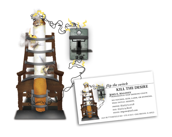
flip the switch logo/illustration and collateral - Illustrative logo drawn and collaged in Photoshop. Client had clear direction for concept .

Reef Design Group logo - The client needed a new logo to go along with their new web presence. With a limited color palette the new logos were meant to appeal to high-end clientele and communicate the peaceful aspects of keeping tropical fish.
gLike
logos business cards and stationery