Global Warming article - These spreads were created for a political magazine about global warming and how the facts have been ignored for too long. I wanted to use mainly text and "the facts" for this, the drawing of Bush being the only thing that isn't.

Toilets in Foreign Countries - An magazine article about how nasty bathrooms in foreign countries are.
Illustration by Gayle Himmelstein.
Disclaimer: This is not my opinion, we were given the article to design, in fact, the only other country I've ever been to is Canada...I don't think that counts... : )

Cary Collection Directory - This is the front and back cover of a guide to the art collection at Rochester Institute of Technology. The book is 28 pages and 7"x10" when folded.

Cary Collection Directory - This is the one of the spreads of a guide to the art collection at Rochester Institute of Technology. The book is 28 pages and 7"x10" when folded.

Cary Collection Directory - This is a 2 page spread of a guide to the art collection at Rochester Institute of Technology. The book is 28 pages and 7"x10" when folded.

Book Cover Series - These book covers are all for books from the Beat Generation and are all done without computer-made type.

Book Cover Series - These book covers are all for books from the Beat Generation and are all done without computer-made type.

Book Cover Series - These book covers are all for books from the Beat Generation and are all done without computer-made type.

Book Cover Series - These book covers are all for books from the Beat Generation and are all done without computer-made type.

Book Cover Series - These book covers are all for books from the Beat Generation and are all done without computer-made type.

BECHS Identity System - Logo design for a local historical society. They love their building which has beautiful columns, so I incorporated them into the logo.

BECHS Business cards - 2 options for the historical society, with their respective backs. The floral design was taken from a wrought iron fence on exhibit in the museum. I kept most of their materials 1 color to be cost effective because they have very limited funds.

BECHS Letterhead and Envelope - I kept most of their materials 1 color to be cost effective because they have very limited funds.

BECHS Membership card and holder - This is the membership card for the historical society which would be sent to the customer in a foldover card.
I kept most of their materials 1 color to be cost effective because they have very limited funds.

BECHS Rack Card - This is the only object I designed in full color to catch more attention. The image is of fans actually held in the museum. The ends would be perforated so it could be seperated and serve as another business card with all their important information.

BECHS Museum Map - This is a 2-sided map that would be given upon entering the museum as a guide to the different exhibits. It is designed as black and white and to be a half of a letter sized sheet to be cost effective. When folded, you would be able to view the map and descriptions together.

BECHS Current Signage - This is a summary of all of the museum's current signage which is very outdated.

BECHS Proposed Signage - This is how I would replace their signage, incorporating their new identity system.

Chimera Icon - A simple icon of a chimera; a mythological creature with the head of a lion, body of a goat and the tail of a snake.

XGames Symbols - These are symbols created for the X-Games; which is similar to the Olympics, only it's for extreme sports. I created them with scribbles instead of using solid colors to give them more movement.

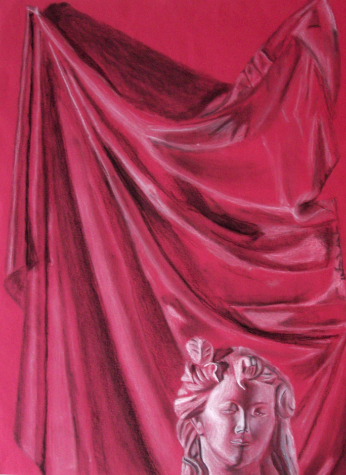
Chalk and charcoal on colored paper

Cylinders - Chalk and charcoal drawing of plastic cylinders, a bag and fabric

Chalk and charcoal on colored paper of a school hallway

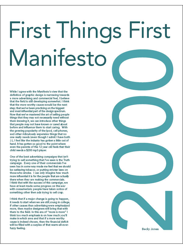
This is a collection of essays about different artists.

This is a collection of essays about different artists.

This is a collection of essays about different artists.

This is a collection of essays about different artists.

This is a collection of essays about different artists.

This is a collection of essays about different artists.

This is a collection of essays about different artists.

This is a collection of essays about different artists.

This is a collection of essays about different artists.
gLike


