
Beacon direct mail piece - Beacon is a do-it-yourself professional survey tool - that happens to be as easy to use as it is powerful. I worked as art director from concept through design on this custom "slider" mail piece.
CW - Angela Reid
CD - Paul Evers

Beacon collateral - "Behind the easy-to-use interface is a surprising amount of power." Beacon is a do-it-yourself professional survey tool. This campaign champions the strategy that Beacon is both easy to use and extremely powerful. I worked as art director from concept through design, partnering with local photographer Steve Tague to shoot the images.
CW - Angela Reid
CD - Paul Evers
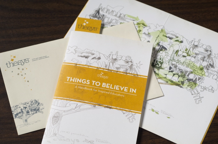
Thesys "Summer Reading" book - This was a special direct mail piece to inspire school faculty and administrations – potential customers for Thesys, an education tool. Design & art direction by Matthew Ebbing, copy writing by Angela Reid, illustrations by Tom Monson and Sarah Mikolowsky. Project of tbd agency (tbdagency.com).

Decipher - Direct Mail - Decipher is a data research and analysis company. This campaign highlights Decipher's curiosity of human behavior - demonstrating to the world of research professionals that they "get it" - that they are just as curious as you are.
CD - Paul Evers
CW - Angela Reid

I created a white graphic system inspired by climbing and outdoor/nature shapes to convey Cloudveil as a contemporary, yet mountain-inspired brand. These new graphics & a new type treatment would be incorporated in their catalogs and the art direction for their national ad campaign. I worked closely with Cloudveil’s marketing team to build a catalog that pushed the product as heros in a clean-reading book that retained an authentic mountain lifestyle vibe through copy and image.

Health In Harmony _ Identity and Cover System Design - This project was done as part of my personal design studio, Wide Open Creative. The personality of the Health In Harmony publication was growing tired and dated. The objective was to take the magazine from a place of appreciated existence as an accessible resource to a place of genuinely desired possession – a cool find for the new reader, and a refreshing face-lift for the regulars. The renewed the visual voice of Health In Harmony is exciting and intriguing a widening audience.

Event Fabrics _ Logo, Identity, Catalog - After the Event brand managers at GE chose to pursue a logo concept I had created, it was my task to design their new identity system and brand book. As a champion of the brand, I have also enjoyed creating trade show graphics, point-of-purchase systems, labels, tags and various interactive media for Event Fabrics for both USA and European markets.

Mion Footwear Catalog Design - Mion Footwear, the special project of Martin Keen (founder of Keen® Footwear) teaming this time with Timberland®, was a very unique client. Martin had a strong vision for the aesthetics of the footwear, but looked to tda for a means to present them. Sitting down with Martin to work through design concepts and sandal naming was interesting, to say the least. The launch of this new brand was successful, and their list of dealers continued to grow.

This project was done as part of my personal design studio, Wide Open Creative. Impact International came to the local New Zealand design studio, Cabin Fever, in need of a booklet to stimulate thought process among Apple Sales Managers. Under contract to Cabin Fever, we worked to create this 52-page workbook. Clean, contemporary design coupled with 12 custom models and diagrams make this a solid resource piece for Impact International's Apple Sales program.

Thule catalog - Not just another run-of-the-mill catalog, our Thule catalogs often carried stories of their own. In this case we created a road trip guide that my design used as a common thread throughout the 2008 Thule North American Catalog.
gLike
Catalogs, books, direct mail