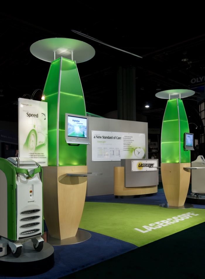

Laserscope - Laserscope had a significant mission: to introduce a new identity for its surgical division, launch a new product, and to announce a partnership with Stryker. Accomplished by using two exhibits—a 30’ x 50’ for the launch and a 20’x20’ to promote the partnership. To achieve these objectives, the design integrated their new look and feel, included a laser wet lab, Operating Room Suite setup and utilized state of the art A/V technology and lighting to create color and movement.


Lundbeck - When global pharmaceutical giant Lundbeck expanded its presence to the U.S., this design was chosen to for the product launch of Sabril. Large internally lit fabric headers at multiple levels are supported by backlit towers. The exhibit, a convergence of brand identity colors, diagnostic tools and product information, houses a multi-tiered environment where educational opportunities take place around freestanding touchscreen kiosks.


.


American Medical Systems - This design was selected by AMS as the first of many in an exhibit program for both domestic and international markets which reflected the company’s new brand personality. The design featured the Greenlight Theater - a space where doctors could experience firsthand the Greenlight HPS laser, in a fully functioning wet lab. A series of demonstration towers clearly defined male and female therapies and enabled AMS to showcase their products through the use of video monitors and display cases.


NeurogesX - This design was selected for the launch of the launch of a new drug for pain management. The inspiration for the lightweight fabric arches framing the booth is the ability of the Qutenza patch to adhere to the contours of the body. The fabric curves are lit by changing LED lights. Two screens displaying video content are positioned at the front of the booth, and the rear of the booth houses a medical affairs area.

NeurogesX - This design was selected for the launch of the launch of a new drug for pain management. The inspiration for the lightweight fabric arches framing the booth is the ability of the Qutenza patch to adhere to the contours of the body. The fabric curves are lit by changing LED lights. Two screens displaying video content are positioned at the front of the booth, and the rear of the booth houses a medical affairs area.

Caselogic - Case Logic, launched a major re-branding campaign and worked in collaboration to develop the new brand experience in the trade show and retail environment. In this “Life, Simplified” exhibit, the design was brought to life at CES highlighting organization, flexibility, and simplicity. Intelligent space organization facilitated product accessibility, staff/visitor interactions, and intensified branding. After a successful launch this was then carried through to all customer experiences.


Zero.net - 50 x 50 Custom Double Deck Exhibit for a venture capital firm.

Zero.net

Imagine Media - 20'x 30' Custom Exhibit - Publishing Company

Prestwick Pharmacuetical - Prestwick, a pharmaceutical company specializing in drugs for the central nervous system, announced its new product launch with a new exhibit inspired by the neuron in its logo.
Three fabric blades hang within a powerfully back lit arch that reinforces the logo and creates a semi private interior. The structure and chandelier lighting repeats the neurological motif. The cable-hung graphics are easily changeable and lit from the overhead metal ring encircling the exhibit.


Cisco Systems Mobile Exhibit - Cisco Systems' IP networking solutions are the foundation of the internet and most corporate, education, and government networks. This 50' x 8' Traveling Truck exhibit was selected to showcase Cisco's brand presence as the worldwide leader in networking for the internet, providing the broadest line of solutions for transporting data, voice and video, around the world.

Cisco Systems Mobile Exhibit

Bell Sports Mobile Exhibit - A traveling exhibit on the history of Bell Sports from 1923 to the present. More world champions have worn Bell Helmets than all other helmet brands combined.
From Grand Prix racing through the Indy 500 to olympic cycling, Bell helmets have played a vital role in protecting sportsmen and women for nearly 50 years.

Bank of the West - The Bank of the West lobby utilizes historical displays to tell the story of the Bank’s growth and progress since its inception in 1874. In the lobby, the Bank builds its brand, reinforces its stature as a founding banking institution in the West, attracts new customers and emphasizes its commitment to maintaining strong personal relationships with its clients and partners. With strong corporate branding, museum displays and media, visitors experience immersion in the Bank’s culture.

Bank of the West - The Bank of the West lobby utilizes historical displays to tell the story of the Bank’s growth and progress since its inception in 1874. In the lobby, the Bank builds its brand, reinforces its stature as a founding banking institution in the West, attracts new customers and emphasizes its commitment to maintaining strong personal relationships with its clients and partners. With strong corporate branding, museum displays and media, visitors experience immersion in the Bank’s culture.

Bank of the West - The Bank of the West lobby utilizes historical displays to tell the story of the Bank’s growth and progress since its inception in 1874. In the lobby, the Bank builds its brand, reinforces its stature as a founding banking institution in the West, attracts new customers and emphasizes its commitment to maintaining strong personal relationships with its clients and partners. With strong corporate branding, museum displays and media, visitors experience immersion in the Bank’s culture.

TouchDiva - TouchDiva chose this design to introduce its product to the U.S. market, generate word of mouth, and create show floor buzz. The exhibit used a 20” Octanorm grid backwall with backlit and opaque squares, LCD monitors featuring rotating album cover artwork, and a sound system to stream music. This design was selected as Silver Best 10'x20' in the 2011 MOD Awards.

gLike


